Bad Kimono Co.
Bad Kimono Co. started with a clear strategic gap: Brazilian jiu-jitsu apparel is crowded, and most brands either chase hype or blend into generic fightwear. The opportunity was to create something sharp, sensible, and recognizable.
My role was to develop the brand system before the product reached market. That meant shaping the positioning, product language, visual identity, launch structure, and content strategy so every piece worked together. There’s plenty to gab about as a Fractional CMO but that sort of lingo is best left for when the Patagonia vests are sitting in the room. The objective was not to sell apparel through noise, making the products feel distinct enough that people understood the brand before they ever saw a price.
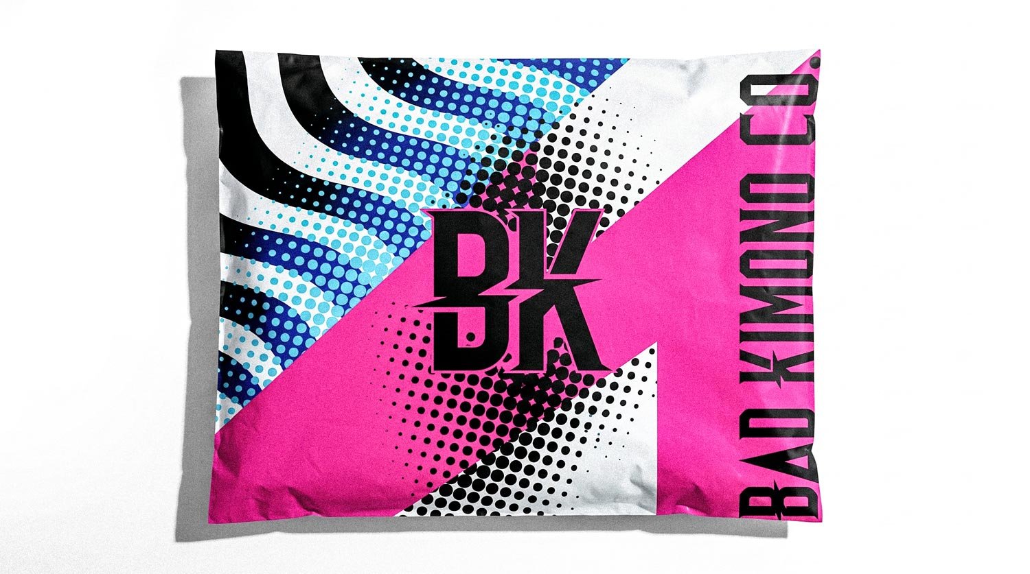
The strategy focused on controlled releases, premium product perception, and community-led demand (fabricated at first, but real followed). Instead of leaning on discounts which destroy ROAS or opening a black hole of paid media, the launch used anticipation, product storytelling, creator seeding, and direct audience capture. Every decision had to make the brand feel intentional: the naming, photography, product copy, packaging, release cadence, and social presence.
Bad Kimono Co. needed to feel credible on the mat, not like another generic Shopify apparel brand. We tapped into the core culture of JJ, and that meant making music for live rounds. Over an hour of original music that Jiu Jitsu practitioners could use and vibe with (and talk about of course) “who is that?” “what artist is that?” Bad Kimono Co.
The work became a full brand and growth framework: product narrative, ecommerce structure, preorder communication, influencer seeding, owned-channel content, and a repeatable release model. The result was a brand designed to move with scarcity, confidence, and cultural relevance while staying grounded in real product detail.
"Music for strangling your friends"
| Real Killers |
"Music for strangling your friends" | Real Killers |

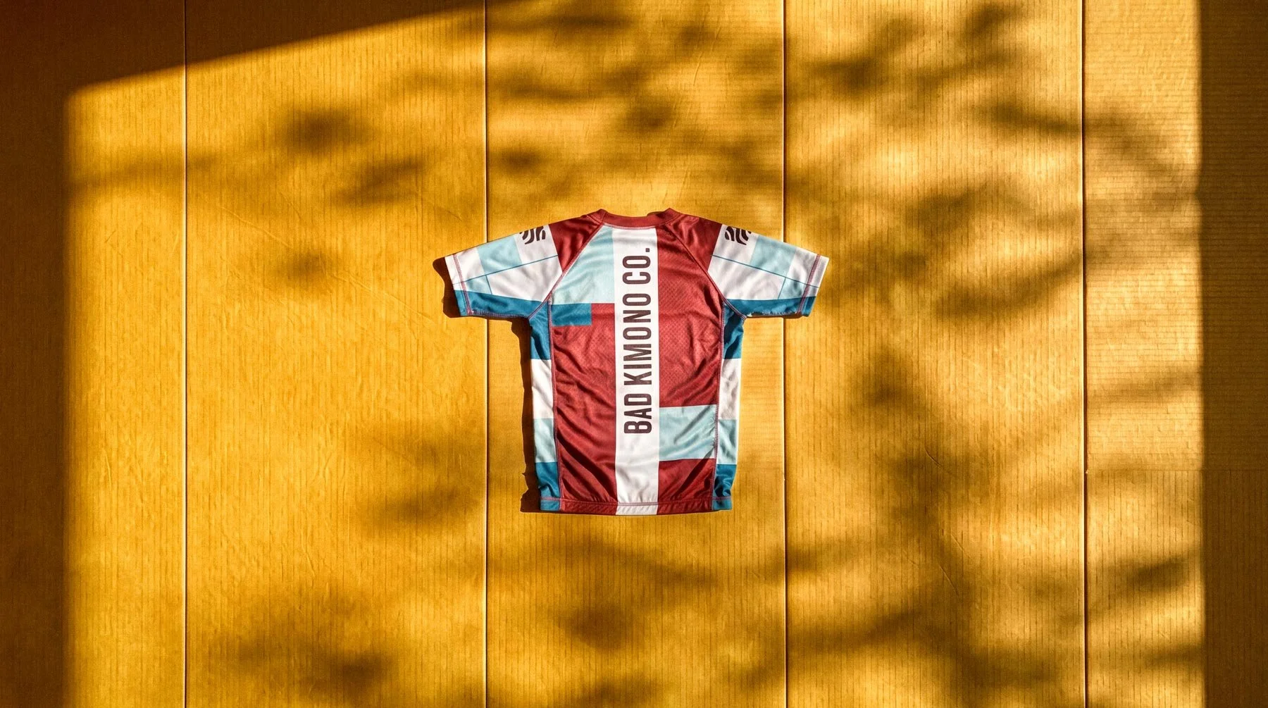
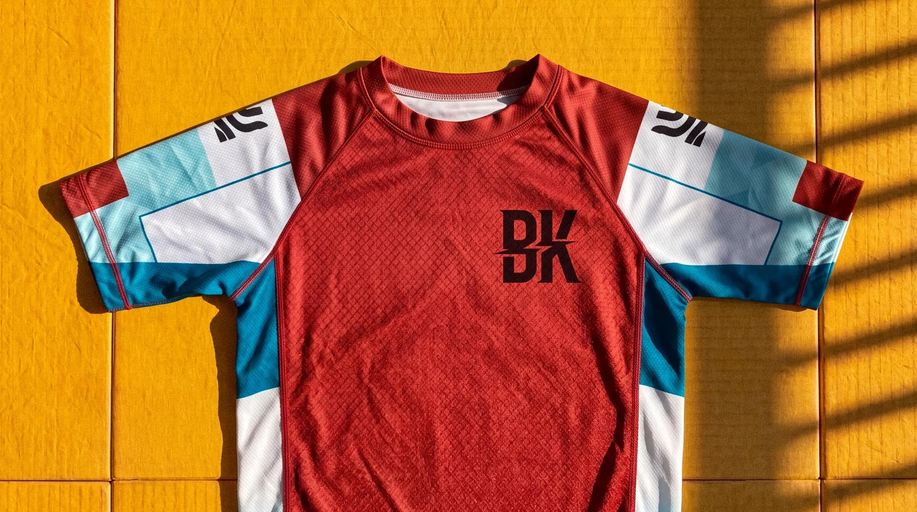
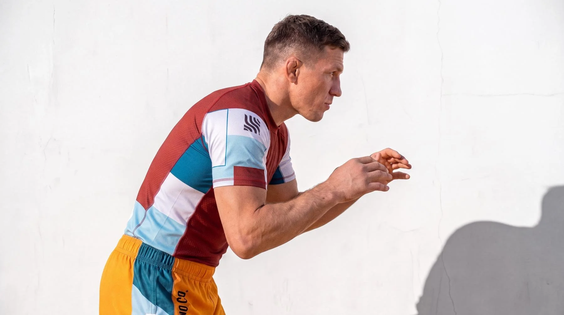
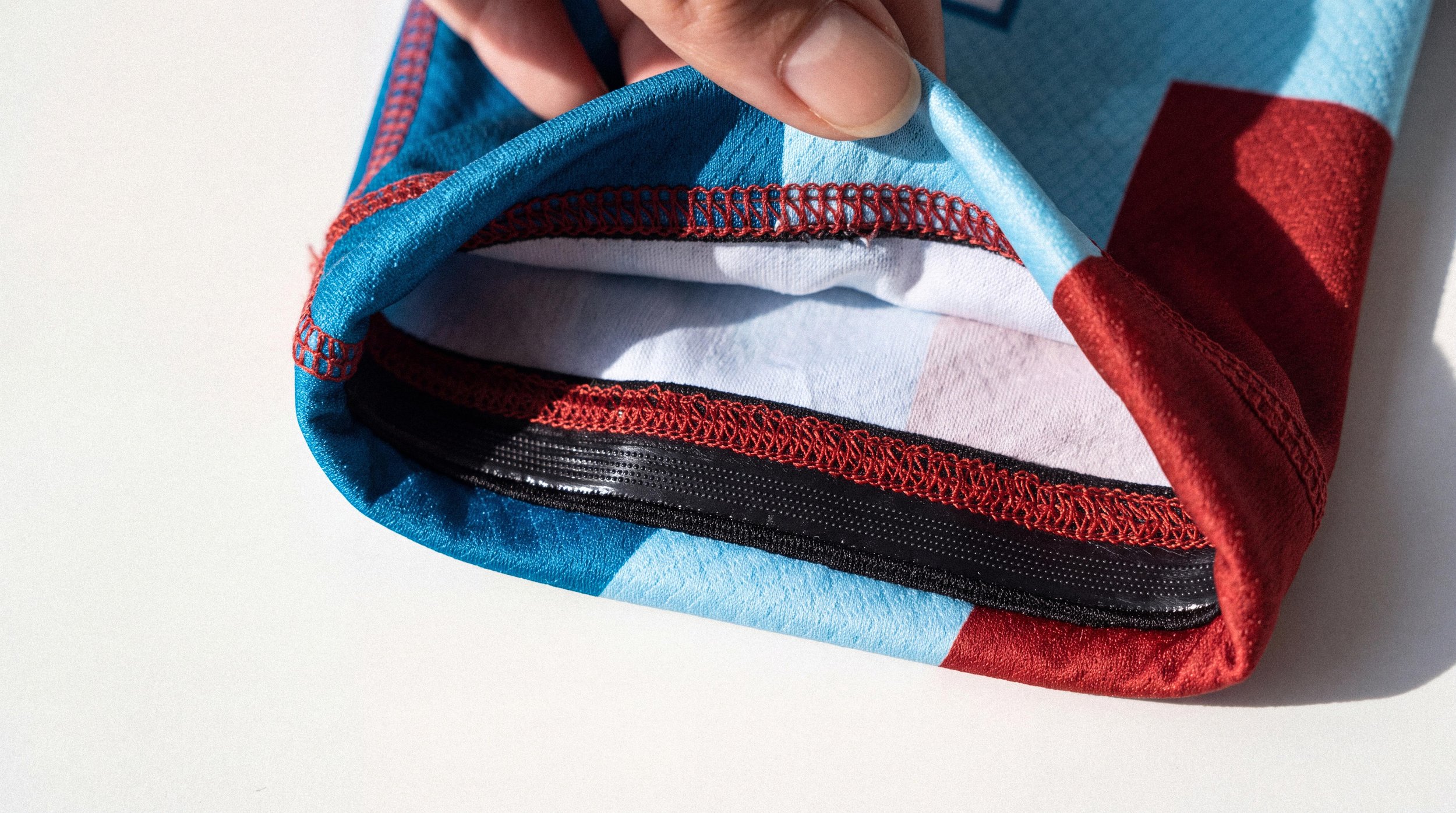
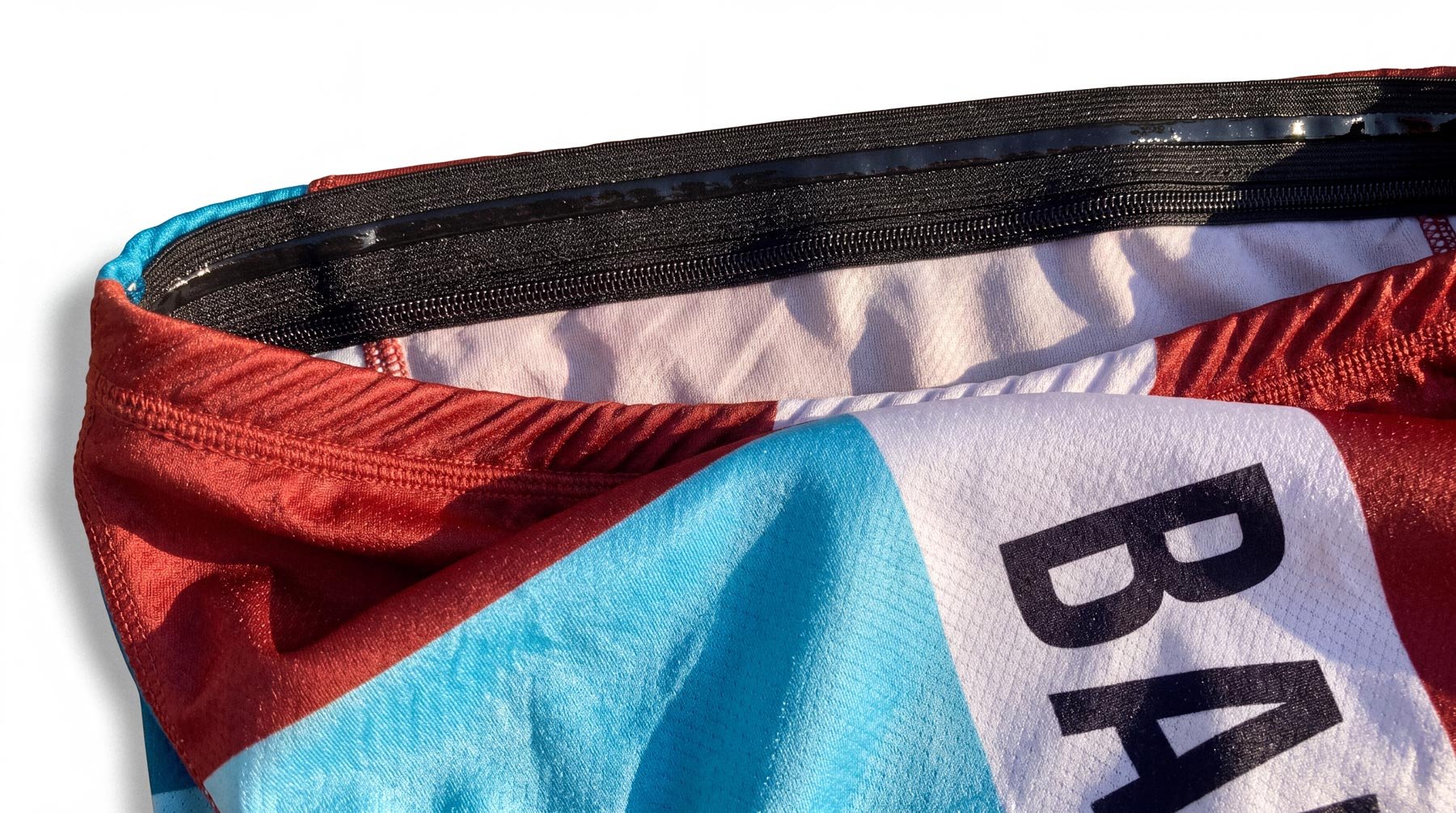
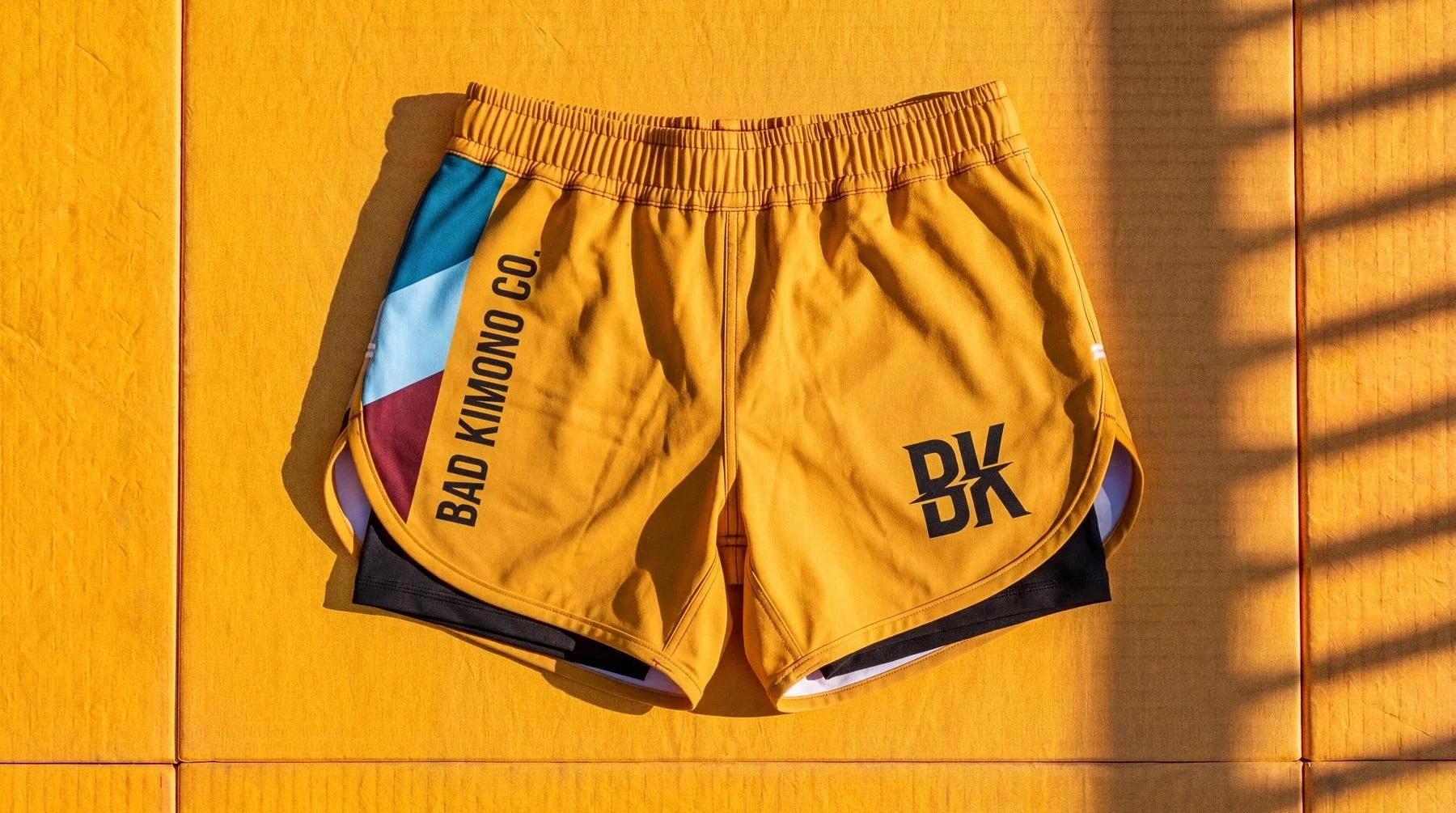
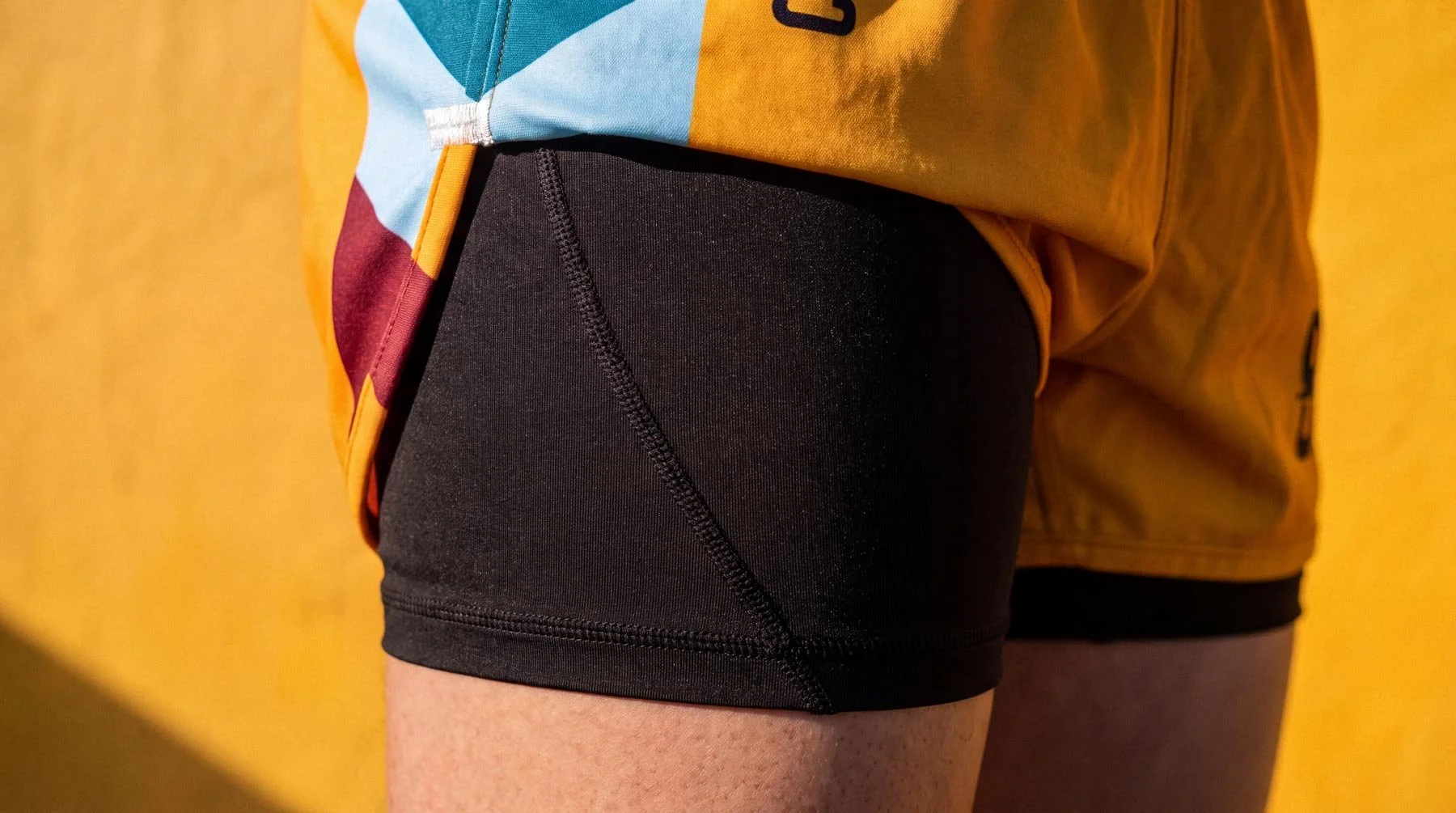
No Two Alike (CPG)
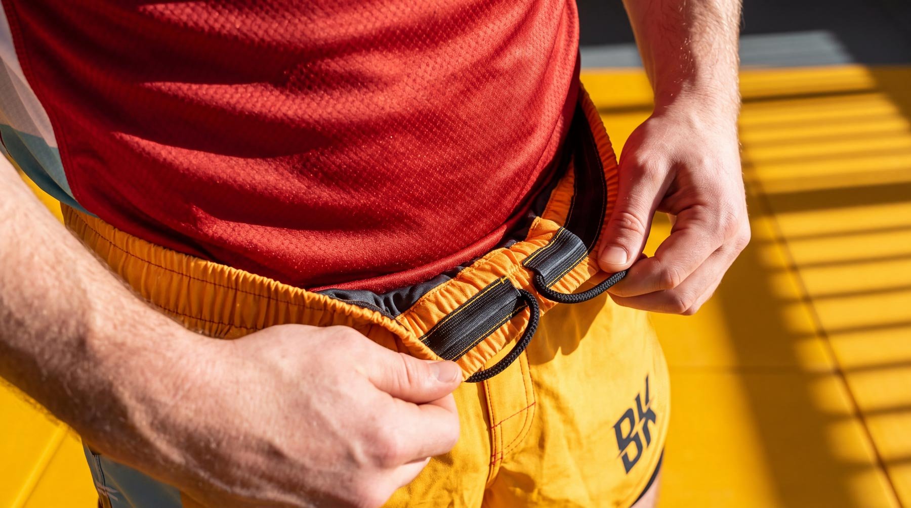
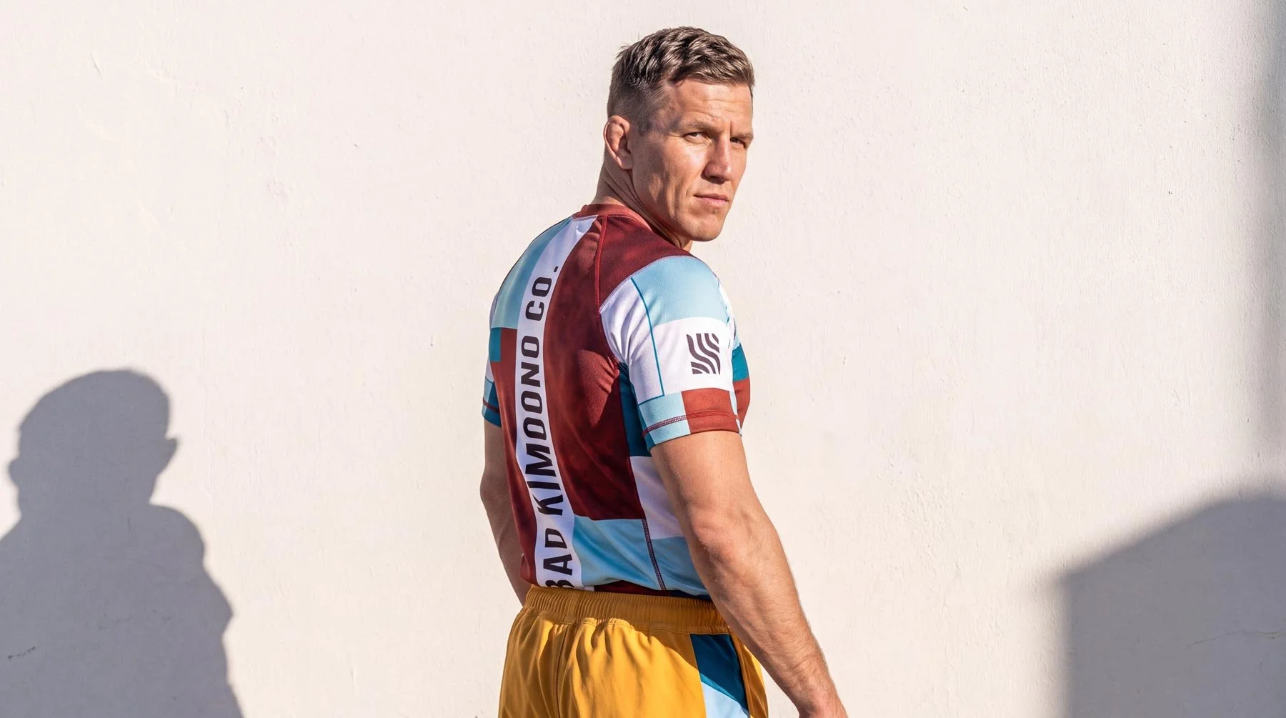
Every drop had a different feel, attitude, and this was only made possible by extremely low MOQs, but dozen's of designs we’re created and shipped. It was all unapologetically BAD Kimono Co. We insisted that UGC was anything but boring and it fed the illusion of a brand bigger than it’s britches.
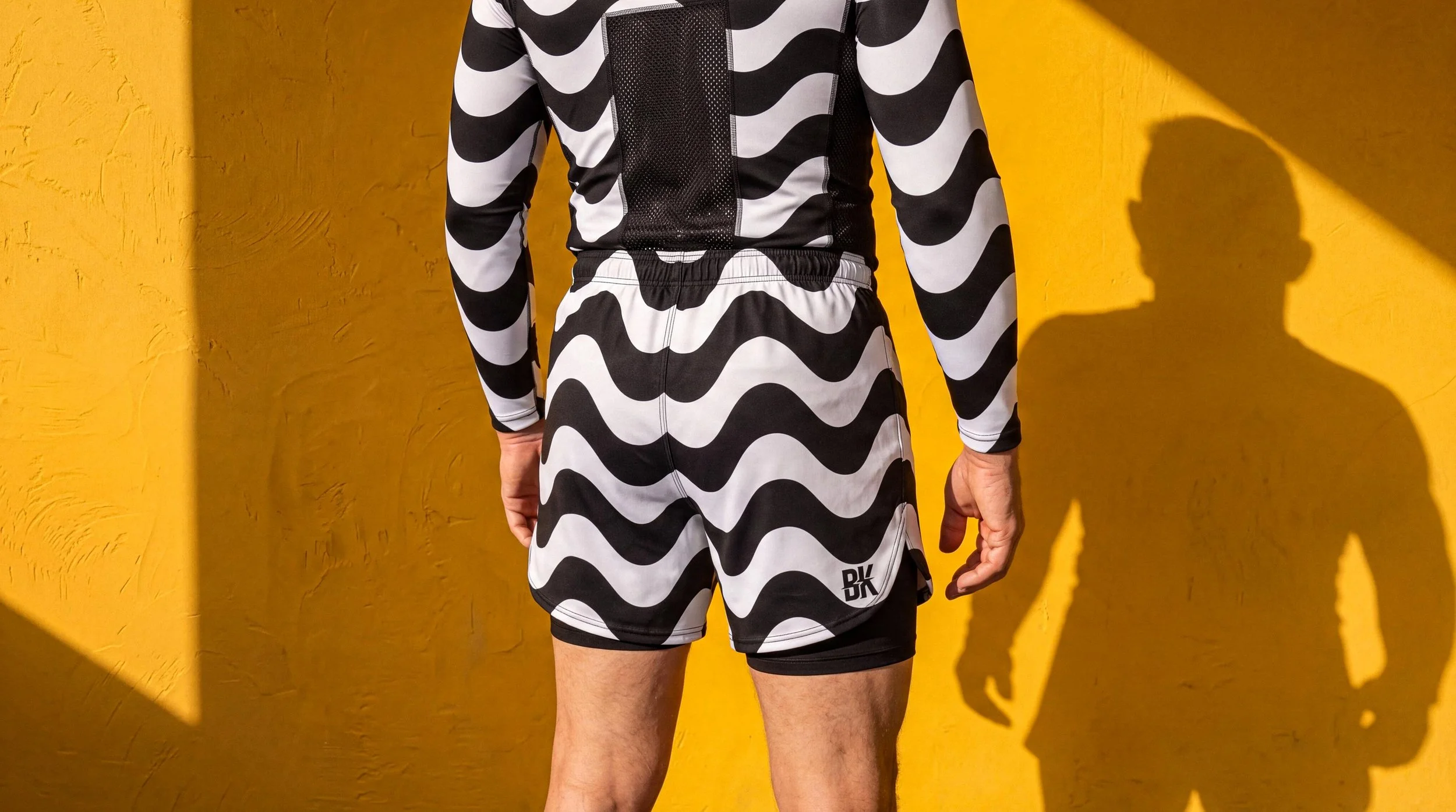
Positioned to POP
Pristine Photography OUTSIDE of the gyms and academies, where the sun felt bright fresh an warm. UGC would cover the gym scene.